
How to Choose Brand Colors That Resonate with Your Audience
Summary
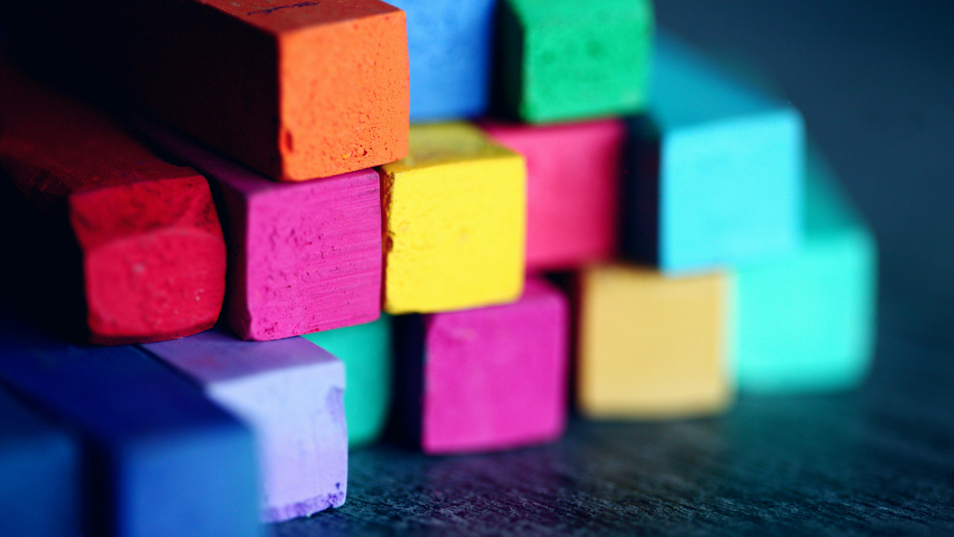
Choosing the right brand colours shouldn’t be based on personal preferences, but should be chosen with a psychological strategy in mind.
Research demonstrates that colour can increase brand recognition by up to 80%, with 85% of consumers citing colour as the primary reason for purchasing particular products.
The most effective brand colors are those that create authentic emotional connections whilst maintaining consistency across all touchpoints, ensuring your audience feels precisely what you intend them to feel about your brand.
Understanding how to choose brand colours strategically can transform your marketing effectiveness, build deeper customer relationships, and create lasting competitive advantages in today's visually-driven marketplace.
Brand colours are a psychological strategy that can increase recognition by 80% and influence 85% of purchase decisions
What is Brand Color Psychology?
Brand color psychology examines how different hues influence consumer perceptions, emotions, and purchasing decisions. This field combines neuroscience, psychology, and marketing research to understand why certain colours trigger specific responses in the human brain.
When we encounter colours, our brains process these visual signals within milliseconds, often triggering emotional reactions before conscious thought occurs. This automatic processing explains why colour choices can dramatically influence consumer behaviour—research indicates that up to 90% of snap judgments about products are based on colour alone.
Color psychology operates on multiple levels simultaneously. At the physiological level, different wavelengths of light stimulate various neural pathways, potentially affecting everything from heart rate to hormone production. At the psychological level, colors evoke learned associations developed through cultural experiences, personal memories, and universal human responses to natural phenomena.
Why Brand Colors Matters More Than You Think
The significance of color in branding extends far beyond aesthetic appeal. Contemporary research reveals that brand colors function as powerful communication tools that operate independently of written or spoken language.
Brand Recognition and Memory Enhancement
Consistent use of strategic colour choices can increase brand recognition by 80%, according to studies. This enhancement occurs because color provides an additional "tag" of information that helps consumers process and store brand memories more efficiently than colorless representations.
The memory enhancement effect is particularly pronounced in natural color applications. Research published in the Journal of Experimental Psychology demonstrates that "living color" significantly improves recall compared to monochromatic alternatives, with participants showing measurably better recognition rates for coloured brand elements.
Consumer Decision-Making Impact
The influence of color on purchasing decisions is both immediate and profound. Studies consistently show that 85% of consumers cite color as the primary factor in their purchase decisions. This influence operates through multiple psychological mechanisms.
Emotional Triggers: Colors evoke specific emotional responses that directly impact brand perception. Blue consistently promotes feelings of trust and reliability, making it favoured by financial institutions and technology companies. Red generates excitement and urgency, explaining its prevalence in retail and food service sectors.
Quality Perceptions: Color choices significantly influence perceived product quality and value. Research demonstrates that darker, richer colors like black and navy suggest premium quality, whilst lighter hues may imply affordability or accessibility. This perception directly affects consumers' willingness to pay premium prices.
Cultural and Demographic Considerations: Color psychology varies considerably across cultural and demographic boundaries. For instance, whilst white represents purity in Western cultures, it may symbolise mourning in certain Asian contexts. Understanding these variations is crucial for brands operating in diverse markets.

Leverage color psychology to influence purchase decisions: specific hues trigger emotional responses and directly shape perceptions of product quality and value
How Different Colors Influence Consumer Psychology
The Power of Primary Colors
Red: Energy and Urgency
Ever noticed how "Sale" signs are almost always red? This isn't just a random choice but rather a strategy backed by science. Research in color psychology shows that red triggers excitement and a sense of urgency, effectively encouraging impulse purchases.
This effect is supported by extensive research. A comprehensive meta-analysis in the Journal of the Academy of Marketing Science confirmed color's potent influence on consumer perception and behaviour, particularly noting red's ability to attract attention and stimulate arousal.
Moreover, studies in psychology, have demonstrated that red can also activate avoidance motivations, underpinning its potential to cause negative reactions if misapplied. The science behind this duality shows that while red attracts attention and stimulates arousal, it can also activate avoidance motivations. The key for brands is to use red's energy as an accent rather than a dominant theme.
Blue: Trust and Reliability
In contrast to red’s urgency, blue emerges as the most trusted color across multiple research studies. The "Trustworthy Blue" phenomenon occurs because blue environments reduce stress hormones and promote feelings of security and dependability. This explains why majority of financial institutions incorporate blue into their primary branding.
Neuroimaging studies reveal that blue activates brain regions associated with calm decision-making rather than impulsive behaviour, making it ideal for brands requiring consumer confidence in complex purchasing decisions.
Yellow: Optimism and Attention
Yellow excels at capturing attention and promoting optimism but risks overstimulation if used excessively. The key lies in strategic application—using yellow as an accent rather than dominant color.
Research in color psychology suggests that yellow is a high-arousal color that can stimulate mental energy and attract attention. This makes it a potentially effective tool for highlighting critical information and creating engaging educational materials.
However, its efficacy for improving specific cognitive functions like memory retention is not conclusively proven, and its overuse can lead to visual fatigue, limiting its utility as a primary background colour.
Secondary and Complex Colors
Green: Growth and Trust
Green in psychology research reveals fascinating complexity in consumer responses. Different shades of green evoke distinctly different associations; bright greens suggest health and vitality, whilst darker greens imply luxury and sophistication.
Studies show that 88% of consumers associate green with environmental responsibility, making it essential for brands emphasising sustainability. However, certain green shades can feel clinical or artificial, requiring careful shade selection.
Purple: Luxury and Creativity
Purple occupies a unique position in color psychology research, showing the most individual variation in emotional associations. Whilst some consumers associate purple with luxury and creativity, others find it overly extravagant or artificial. This inconsistency suggests purple requires careful audience testing before implementation.
Black and White: Sophistication and Simplicity
Cross-cultural research in marketing confirms that the achromatic colors black and white hold consistent psychological meanings across demographic groups. Black is associated with sophistication, luxury, and power, while white is linked to simplicity, cleanliness, and, in a modern brand context, innovation.
Furthermore, the fundamental design principle of figure-ground contrast from Gestalt psychology confirms that their combination creates the highest possible visual contrast. This enhances readability, as defined by web accessibility standards, and increases brand recall by making visual elements more salient and memorable.
Black and white branding leverages timeless color psychology, with black conveying luxury & power and white signaling simplicity & innovation, while their high contrast boosts readability and brand recall
Understanding Your Audience's Color Preferences
Demographic Influences on Color Perception
Research consistently demonstrates that colour preferences and associations vary significantly across demographic lines. Understanding these variations is crucial for effective brand colour selection.
Gender Considerations
Studies reveal measurable differences in color preferences between gender groups. Research shows that female consumers demonstrate stronger preferences for purple and red compared to male consumers, who show greater affinity for blue and green.
However, these preferences continue evolving with changing social norms and generational shifts.
Age-Related Variations
Generational differences in color perception present significant implications for brand strategy. Research indicates that younger consumers (18-25) show greater acceptance of vibrant, unconventional colours for traditionally conservative product categories, whilst older demographics prefer established colour associations.
Generation Z consumers, in particular, demonstrate heightened sensitivity to colors representing identity, values, and authenticity, making color choice crucial for brands targeting this demographic.
Cultural Context and Global Considerations
Cross-cultural color psychology research reveals both universal patterns and significant regional variations. A comprehensive study examining color-emotion associations across multiple countries found that whilst certain associations remain consistent (black with sadness, red with passion), important cultural differences exist.
For example, Chinese consumers associate white with sadness in addition to relief, unlike Western associations. Egyptians don't associate yellow with joy as consistently as other cultures, and Greeks associate purple with sadness rather than positive emotions.
Industry-Specific Color Expectations
Consumer research demonstrates that different industries have established color expectations that significantly influence brand perception. Violating these expectations can create attention but may undermine trust.
Healthcare and Wellness: Healthcare and wellness branding is overwhelmingly dominated by blue and green. This strategy is grounded in environmental psychology research, which demonstrates that these 'cool' hues can lower physiological arousal and promote a sense of calm and safety.
Studies have found that patients in rooms with blue or green elements report significantly lower levels of anxiety and higher feelings of comfort compared to those in environments with warmer or more neutral colour schemes.
Food and Beverage: Red and yellow stimulate appetite and suggest freshness, explaining their prevalence in restaurant branding. Studies demonstrate that red environments can increase food consumption by up to 25%.
Technology: In the technology sector, blue and grey are dominant colors in branding for their ability to convey critical attributes. Extensive research in colour psychology confirms that blue is powerfully associated with trust, dependability, and competence—essential qualities for convincing consumers to adopt new technology.
Grey complements this by communicating neutrality, precision, and a sleek, futuristic aesthetic. The use of this colour scheme by major tech firms (e.g., IBM, Intel, Dell, Facebook, LinkedIn, Samsung, HP) is a strong market-based indicator of its effectiveness in building consumer trust.
The Science Behind Color-Brand Congruence
Brand Personality Alignment
Research examining the relationship between color and brand personality reveals that successful color choices align with intended brand characteristics.
Using Aaker's five-dimensional brand personality framework (sincerity, excitement, competence, sophistication, and ruggedness) the research demonstrates clear colour-personality associations.
Sincerity Associations: Colors like yellow and green consistently evoke perceptions of sincerity and authenticity. Research shows that brands using these colors are perceived as more trustworthy and family-oriented.
Excitement Correlations: Red and orange strongly correlate with exciting brand personalities. Studies demonstrate that consumers rate brands using these colors as more dynamic and energetic.
Competence Indicators: Blue consistently associates with competent brand personalities. Research reveals that professional service brands using blue are rated as more reliable and intelligent.

Aligning your brand's color palette with its core personality builds authenticity and trust, as specific hues like blue for competence or red for excitement trigger distinct psychological associations.
Colour Congruence Theory
The principle of colour congruence suggests that successful brand colors must align with consumer expectations about the product category and brand positioning.
Research demonstrates that congruent color choices enhance brand attitude and purchase intention, whilst incongruent choices can create confusion or negative associations.
A study examining 644 companies found that brands using category-congruent colors achieved 23% higher consumer preference scores compared to those using unexpected colour combinations. However, strategic incongruence can create differentiation when executed thoughtfully.
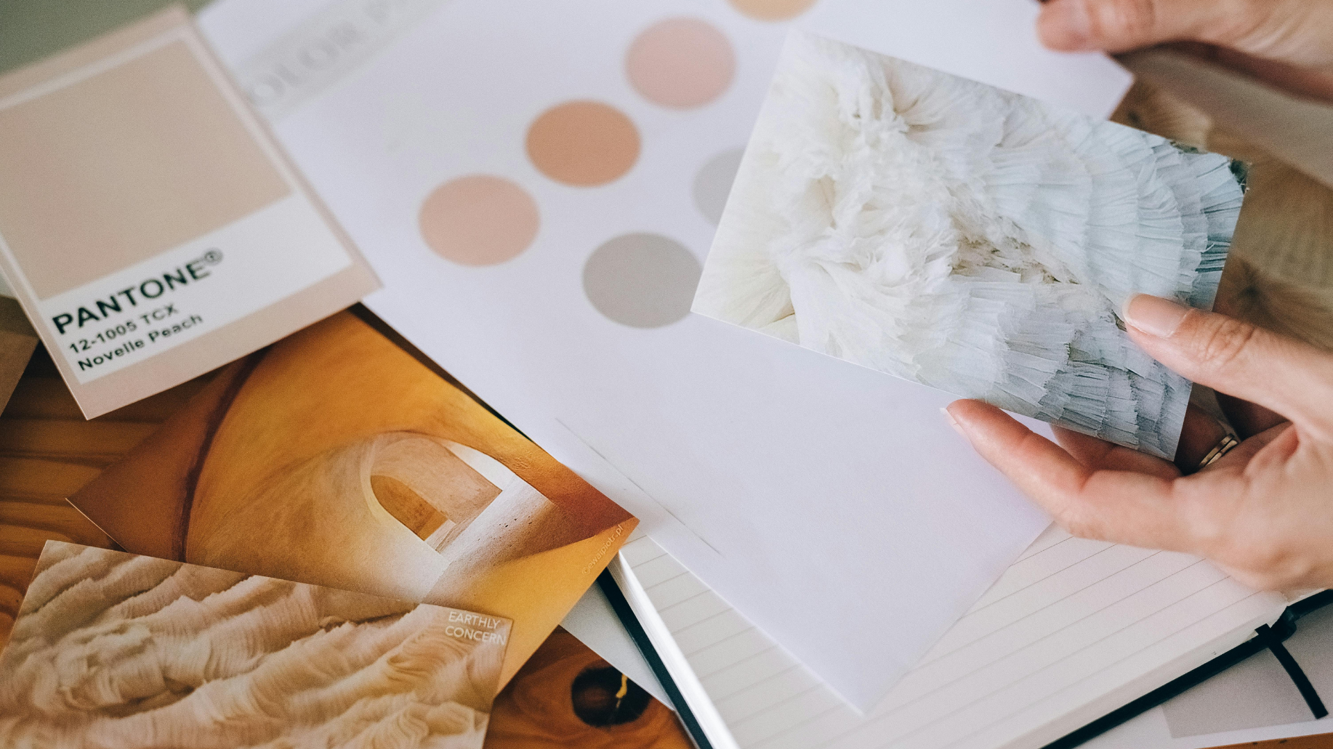
Practical Framework for Choosing Brand Colors
Step 1: Define Your Brand Personality
Begin by clearly articulating your brand's intended personality using established frameworks like Aaker's brand personality dimensions. Consider which emotional responses you want to evoke and how these align with your business objectives.
Research your target audience's demographic characteristics, cultural background, and existing color preferences. Use surveys, focus groups, or A/B testing to validate color associations within your specific market.
Step 2: Analyse Category Conventions
Examine color usage within your industry to understand established expectations. Identify opportunities for differentiation whilst avoiding choices that might undermine essential trust factors.
Consider whether your brand benefits from category conformity (building immediate trust) or strategic differentiation (creating memorable distinction). Research suggests that moderate differentiation often produces optimal results.
Step 3: Test and Validate Color Choices
Implement systematic testing of color options across different brand applications. Use controlled experiments to measure consumer responses to different color schemes, focusing on key metrics like brand recall, emotional response, and purchase intention.
Consider cultural testing if your brand operates in multiple markets. What works in one cultural context may create negative associations in another.
Step 4: Ensure Consistency Across Touchpoints
Develop comprehensive brand guidelines that specify exact colour values for different applications. Consistency across touchpoints increases brand recognition and builds consumer trust.
Create systems for maintaining color accuracy across different media, from digital applications to physical materials. Color variations can undermine the psychological effects you're trying to achieve.

A strategic brand color selection process involves defining your personality, analyzing competitors, testing with your target audience, and ensuring cross-platform consistency to maximize recognition and emotional impact
Common Color Selection Mistakes to Avoid
Following Trends Rather Than Strategy
Many brands make the mistake of choosing colors based on current design trends rather than strategic psychological considerations. Research shows that trend-based colour choices often lack the emotional resonance necessary for long-term brand building.
Successful brand colors should transcend temporary fashion trends and create lasting emotional connections with consumers. Focus on timeless psychological associations rather than momentary aesthetic preferences.
Ignoring Cultural Context
Global brands frequently underestimate the importance of cultural color associations. Color meanings can vary dramatically across cultures, potentially creating unintended negative associations.
Before expanding into new markets, conduct thorough research into local color psychology and cultural associations. What represents prosperity in one culture might symbolise mourning in another.
Overcomplicating Color Palettes
Many brands attempt to use too many colors, diluting the psychological impact of their primary brand colors. The most memorable brands typically use one to three primary colours consistently.
Complex color palettes can confuse consumers and weaken brand recognition. Focus on creating strong associations with a limited color palette rather than trying to incorporate multiple hues.
Neglecting Accessibility Considerations
Failing to consider color accessibility can exclude significant portions of your audience. Research indicates that approximately 8% of men and 0.5% of women experience some form of colour vision deficiency.
Ensure your brand colors maintain effectiveness even for consumers with color vision differences. This often means incorporating sufficient contrast and not relying solely on color to convey important information.
Measuring Color Effectiveness
Key Performance Indicators
Establish clear metrics for evaluating your brand color choices' effectiveness and focusing on measurable outcomes rather than subjective preferences.
Brand Recognition Rates: Measure how quickly and accurately consumers identify your brand based on color alone.
Emotional Response Metrics: Use validated psychological scales to measure the emotional responses your colours evoke. Ensure these align with your intended brand personality.
Conversion Rate Impact: Track how color choices affect key business metrics like click-through rates, purchase completion, and customer retention.
Continuous Optimisation
Brand color strategy should evolve based on performance data and changing market conditions. Successful brands regularly evaluate and refine their color applications.
Implement systematic A/B testing for different color applications, from digital interfaces to packaging design. Small color adjustments can produce significant improvements in consumer response.
Monitor competitor color strategies and market trends to identify opportunities for differentiation or necessary adjustments to maintain relevance.

Measure color effectiveness by tracking brand recognition, emotional response, and conversion rates, then continuously optimize through A/B testing to ensure your palette drives business goals
Future Implications of Color Psychology in Branding
Digital Environment Considerations
The increasing dominance of digital brand interactions creates new considerations for color psychology. Research shows that colors appear differently across various digital devices and screens, potentially affecting their psychological impact.
Consider how your brand colors perform across different digital contexts, from smartphone screens to large displays. Ensure your color strategy remains effective across all digital touchpoints.
Emerging Cultural Shifts
Generational changes and evolving cultural values continue to influence color psychology. Research indicates that younger consumers increasingly associate certain colours with social and environmental values.
Stay informed about evolving color associations within your target demographics. What resonates today may need adjustment as cultural values shift.
Conclusion
Choosing brand colors that truly resonate requires understanding the complex intersection of psychology, culture, and business strategy. Effective color choices can increase brand recognition, influence the majority of purchase decisions, and create the lasting emotional connections that form the bedrock of customer loyalty.
The most powerful palettes are those that align authentically with your brand's core personality, resonate within your cultural context, and are applied with unwavering consistency across every touchpoint.
By applying these research-backed principles, you move beyond aesthetics to harness color's remarkable ability to communicate directly with your audience's subconscious, shaping their perceptions and guiding their decisions.
Ready to transform intuitive color choices into a strategic asset that builds authentic recognition and trust?
Partner with Ainoa to co-create a brand identity that respects psychology, forges genuine emotional connections, and builds lasting brand equity based on subconscious resonance rather than fleeting aesthetic trends.
Together, we can realise a brand that not only stands out visually but is instantly felt and understood, creating the authentic connections that drive lasting loyalty and meaningful engagement.