
What Brands Get Wrong About Pantone’s Color of the Year 2026
Quick Summary
Pantone has selected Cloud Dancer (PANTONE 11-4201) as the Color of the Year 2026. The shade is the first white ever chosen since the programme began in 1999.
Pantone describes the shade as calming, balanced and reflective, offering a sense of clarity during a time of global overstimulation.
Reactions to Pantone’s pick have been mixed: some praise its softness and minimalism, while others call it bland or even tone-deaf in today’s political climate.
Cloud Dancer reflects broader 2026 design trends: emotional minimalism, calm interiors, quiet luxury, and an appetite for clean, intentional visual experiences.
White in color psychology is generally associated with clarity, new beginnings, honesty, transparency, precision, and perceived luxury.
Pantone has announced Cloud Dancer (PANTONE 11-4201) as the 26th Pantone Colour of the Year, and the first white ever chosen since the programme began in 1999.
The company describes the Color of the Year as “a whisper of calm and peace in a noisy world,” and “calls back for human connection”. This statement further reflects Pantone’s reading of the global mood: overstimulation, accelerated technology, shifting political tensions, and a growing desire for clarity, intention, and emotional space.
Each year, Pantone’s Color of the Year influences design, fashion, product development, and marketing. Already, companies like Motorola and Play-Doh have released Cloud-Dancer-inspired special editions.
From a marketing color psychology perspective, white is associated with clarity, new beginnings, trust, openness, and simplicity — but also carries cultural nuances and, in 2026, political sensitivities.
This article explores what Cloud Dancer signals culturally, psychologically, and strategically, and how brands should use it (or not) in the year ahead.
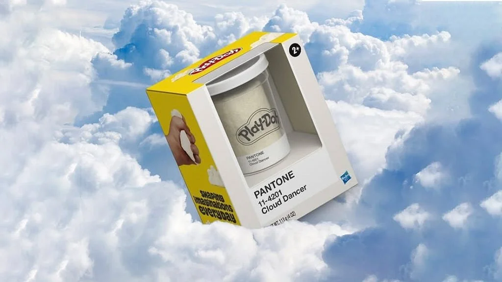
Cloud Dancer colored Play-Doh can found in stores in early 2026. / Image: Hasbro
When White Becomes the Most Provocative Choice
Pantone has been selecting a Color of the Year since 1999, each time attempting to refine the cultural climate into a single visual reference color. Over the years, we’ve seen vivid blues, warm corals, maximalist greens, and expressive pinks — shades that told stories about optimism, connection, or disruption.
Choosing white in 2026 is not conservative, but confrontational in its quietness.
It may look that way, but Cloud Dancer isn’t a blank white.
It’s a soft, airy neutral — balanced, slightly warm, almost gentle. Pantone describes it as “billowy” and “calming”, a visual respite. This airy, calming white is meant to be felt as much as seen.
This choice is rather timely, as many of us have been feeling overwhelmed. Constant historical world events have been tiring us all, and the cognitive overload and noise feel almost impossible to escape.
Lately in design, tech, social media, and even home interiors, maximalism has been replaced by a longing for calm, simplicity and intentionality.
Cloud Dancer is Pantone’s way of saying: In 2026, clarity is the trend.
Pantone’s Framing and Why the Timing Matters
Pantone’s official communication emphasises calm, space, and renewal. Executive Director Leatrice Eiseman highlights that the colour offers “a promise of clarity” and encourages “measured consideration”, offering a welcome contrast to the accelerated pace of modern life.
This particular shade wasn’t chosen accidentally (even though it might look like that).
Cloud Dancer reflects a design landscape increasingly shaped by minimalism and material honesty. Unlike many have interpreted, Pantone doesn’t mean the world should become clinically white in 2026 — just as the world shockingly didn’t become Mocha Mousse brown in 2025.
Pantone encourages pairing the shade with powdered pastels, airy blue-greens, natural browns, soft neutrals, glamourous darks and tropical bold accents. All of these combinations reflect comfort, and many feel future-oriented. Organic textures, tactile surfaces, and sci-fi-adjacent futurist materials are also present in Pantone’s mood boards.
The colors and materials signal the world’s desire for “open space” (both metaphorical and literal) after years of cultural heaviness.
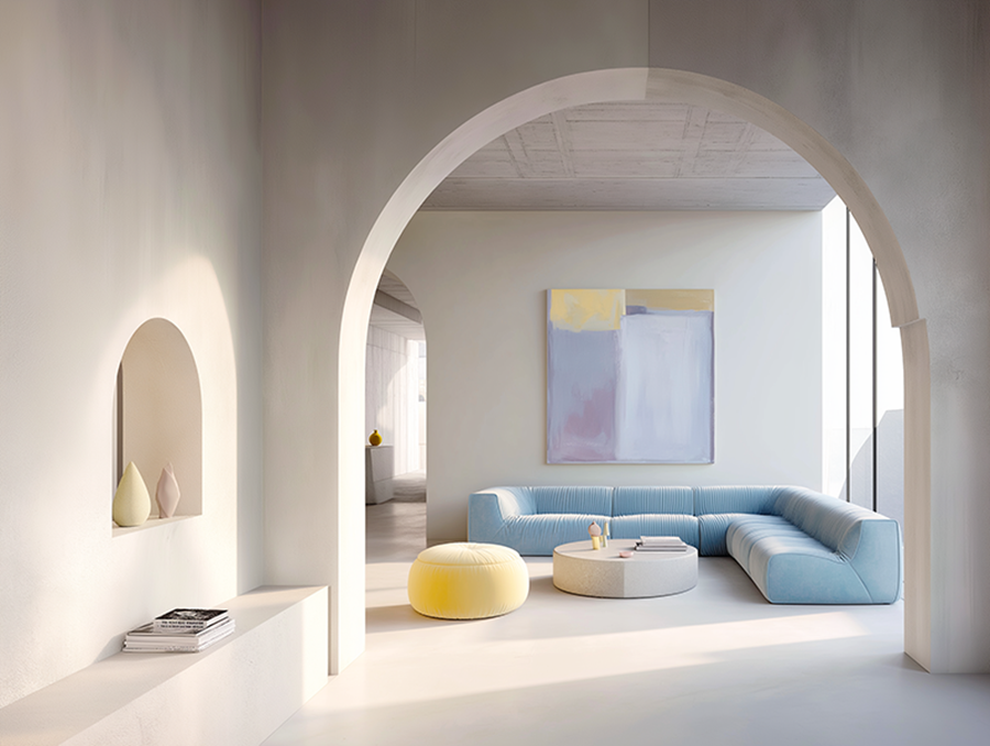
Cloud Dancer reflects recent interior trends calling for space, complimented by earthy hues and calm pastels / Image: Pantone
Mixed Reactions: Calmness, Confusion, and Controversy
Pantone’s announcement didn’t land softly for everyone, and that’s understandable. While many saw Cloud Dancer as a soothing, timely choice, others reacted with confusion, disappointment, or sharp cultural critique.
The range of responses reveals something important: colors have different meanings for everyone. Here’s how the public reacted to Pantone’s pick:
Designers and Minimalists Felt Seen
For many designers and lifestyle brands, Cloud Dancer wasn’t maybe the most surprising pick.
Minimalists, interior stylists, and wellness-focused brands welcomed it as a natural continuation of aesthetic trends we’ve been seeing for years:
“quiet luxury” and laid-back elegance
sustainable, material-led design
calming interiors with muted walls and soft furnishings
natural woods and neutral textiles
a general desire for visual clarity and emotional breathing room
To this group, the white isn’t bland — it’s aligned with how people live, decorate, and consume today. Cloud Dancer feels like an echo of a broader cultural pivot toward simplicity and intentionality.
“Is White Even a Color?”
For others, the announcement fell flat. The Independent captured much of this sentiment, describing Cloud Dancer as “boring”, “uninspiring” and just generally lacking emotional richness
Critics argued that choosing white was a missed opportunity, especially after years of exciting, expressive colours. And yes, some questioned whether white counts as a color at all.
Why Some Saw Cloud Dancer as Tone-Deaf
A smaller but highly engaged corner of the Internet raised sociopolitical concerns.
In a global climate marked by rising far-right movements, racial tension, violence against marginalised communities, and ongoing political instability, choosing white as the symbolic color of the year understandably triggered debate.
The Guardian noted the choice could feel: “painfully tone-deaf”, “politically uncomfortable” and overall insensitive to current global tensions.
These reactions don’t claim Pantone acted with malicious intent; rather, they highlight how color choices land differently depending on the moment we’re living through.

While Pantone’s pick for 2026 might look like a boring white shade, it’s far from the blank paper white.
Worth Noting: No Color Is Ever Neutral
This is where nuance is essential — especially for brand strategists and designers who treat colour as a language.
White is not neutral.
But neither is black.
Neither is red.
Neither is blue.
All colours carry multiple meanings, often contradictory, across cultures, contexts, and histories.
If Pantone had chosen black, backlash likely would have emerged for completely different reasons. Black symbolises luxury and power, but also grief, fear and hopelessness. It carries its own racial interpretations.
Red has been linked to political extremism, but also to love, romance, celebration, sales, urgency, and activism.
Blue is associated with corporate trustworthiness and with law enforcement and state power.
Yellow can signal joy — or danger.
No color arrives without baggage.
So the question isn’t whether Cloud Dancer is “good” or “bad,” or whether people are “overreacting.”
The more responsible and interesting question is: What meanings are people attaching to this color, and why?
Acknowledging this complexity strengthens, rather than dismisses, the commentary.
Pantone Is Reflecting Aesthetics, Not Politics
Despite the sociopolitical anxieties being valid and worthy of discussion, Pantone’s track record makes one thing clear: the Colour of the Year reflects global aesthetics, not political ideologies.
White minimalism has dominated culture for over a decade. Here are just a few examples:
Apple product design
The Ordinary’s clinical branding
Zara, Chanel, and luxury house minimalism
Scandinavian interior design
the “clean girl,” “old money,” and wellness aesthetics
noughties Y2K futurism
sci-fi worlds built in sleek, seamless white
Cloud Dancer mirrors what people already wear, buy, photograph, film, and live in. It represents the aesthetic moment, not a political agenda.
But the cultural conversation around the colour is still important — and, arguably, the most interesting part.
Both “clean girl” and Y2K aesthetics feature muted whites, similar to Cloud Dancer. / Image: Pantone
What White Symbolises in Color Psychology
From a psychological standpoint, white is loaded with meaning — though its meaning changes across cultures. Sci-fi worlds often depict hyper-modern societies in white environments — clinical, seamless, optimised.
Cloud Dancer leans into this “tech minimalism,” offering a bridge between natural minimalism and clean futuristic design.
White also holds more meaning than that.
In Western Color Psychology, White Often Represents:
innocence, clarity and purity
new beginnings
simplicity
honesty and transparency
peace and calm
mental spaciousness
precision, focus and perfection
These meanings are commonly used in brand messaging across healthcare, tech, luxury goods, and wellness industries.
However, white means something else in East Asian cultures, where it often represents mourning or grief. This is worth noting for global brands or brands thinking about expanding to Asian markets.
In branding, white can:
increase perceived trust (associated with clinical cleanliness)
enhance luxury cues (associated with “quiet luxury” and premium minimalism)
reduce visual noise, improving comprehension of text and product features
strengthen contrast, making primary brand colours more powerful
improve perceived product quality when used in packaging (multiple studies show high-white-space packaging is seen as more premium)

Off-whites and muted whites can bring a hint of luxury and elegance into otherwise bold colour palette, like in this Apex Pro’s palette.
What Pantone’s Color of The Year Means for Brands
This is where many news articles and loud commentators get it wrong:
Cloud Dancer is not a sign that all brands should become minimalist.
It does not mean personality must be muted.
It does not predict that bold color identities will fall out of fashion.
Brand personality still drives brand distinctiveness.
A loud brand can — and should — stay loud regardless of what Pantone chooses as their trend color.
Instead, Cloud Dancer signals consumer readiness for calmness, not a rejection of personality.
How brands can use Cloud Dancer intelligently:
As a neutral white: Most brands already use white and black as base neutrals. Cloud Dancer can replace a standard white if the tone feels more aligned with your overall brand.
As a limited-edition or seasonal palette: Product brands can experiment — packaging, capsule collections, special editions.
As an accent for clean layouts: Digital UI, editorial layout, and photography backgrounds. Cloud Dancer creates much-needed breathing room for many designs.
As a grounding layer for high-colour brands: Bold brands often underuse white. Introducing Cloud Dancer can stabilise and elevate strong colours.
What brands should not do is rebrand their core identity just because Pantone picks a color.
Pantone changes its Colour of the Year annually — brand identities should not. Cloud Dancer should inspire brands, not diminish their initial brand promise which is also communicated through strategically selected brand colors.
How to Use Cloud Dancer in Marketing and Branding in 2026
Instead of issuing strict rules, here is what tends to work in design:
White should be architectural: It forms the space your brand lives in and offers breathing room for the main elements.
Texture is non-negotiable: Think matte finishes, natural fibres, fluffy shapes, uncoated stock, soft shadows — these prevent sterility.
Contrast carries the personality: Let Cloud Dancer carry the clarity; let other colors carry the character.
Context matters: In some cultures, white symbolises grief, and in others it symbolises joy. In tech, it symbolises futurism, and in luxury, it signals intent. Brands must interpret accordingly.
Minimalistic does not mean empty: Brands need story, tone of voice, typography, and photography direction. See the white as the frame, not the main message. White needs to be balanced to look good, even in minimalism.
Even bright and colorful brands can leverage white without looking overly minimalistic. Here old vintage labels inspired the design and white space is used to give breathing room to key elements.
Where Brands Often Go Wrong with White
White is tricky because it exposes everything. Its success depends on intention and intensity.
White fails when:
it becomes clinical
it feels like a template
it erases identity and personality
it ignores cultural nuance
it lacks texture or contrast
White succeeds when:
paired with emotional storytelling
grounded in a strong brand strategy
used to highlight, not replace
supported by thoughtful material choices
applied with cultural awareness
This is why some luxury brands thrive with white — because they understand proportion, restraint, and the emotional weight of negative space.
Even for seasoned designers, white minimalism is not easy to master. The Ordinary is one of those brands, in my opinion, that make white minimalism look good, and it fits their core brand personality and strategy.
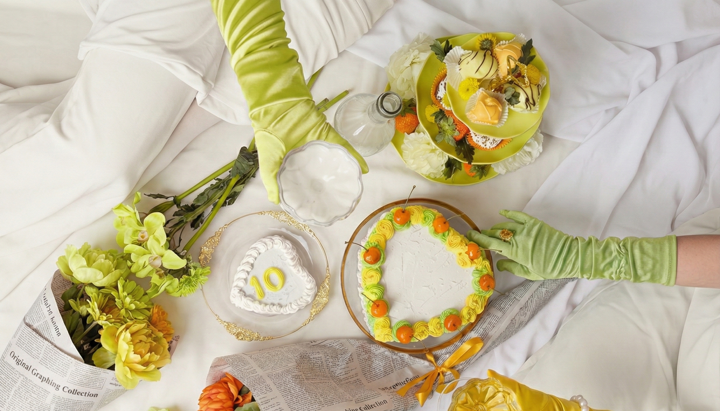
Ainoa’s brand imagery reimagined with Pantone’s Color of the Year 2026 and tropical accents. Image generated with a single prompt in Gemini’s Nano Banana.
FAQ
What is the purpose of the Pantone Color of the Year?
Pantone says the Color of the Year reflects global cultural mood and influences across design, fashion, technology, and socio-economic trends.
Does the Pantone Colour of the Year affect sales?
Yes — indirectly. Color influences perception, trust, emotional response, and purchasing decisions. The Color of the Year adds demand for products in that hue, often driving limited editions (e.g., Motorola and Play-Doh collaborations).
How are Pantone trends used in branding?
Through seasonal palettes, product design, packaging updates, editorial direction, campaign styling, and interior or retail design concepts.
How is color used in marketing and advertising?
Color shapes emotional connection, brand personality, perceived quality, readability, and visual hierarchy — directly influencing customer experience.

Pantone’s Color of the Year doesn’t mean every brand needs to become white and minimalistic.
Conclusion: Cloud Dancer Is a Lens
Pantone is not telling the world or brands to become clinically white, boring, bland and quiet. Instead, Pantone is acknowledging that people are overstimulated and that clarity feels valuable.
Besides a trend color, Cloud Dancer is also a reflection of the cultural moment: a desire to breathe, to reset, to simplify without losing meaning and joy.
For brands, the question is not whether to use Cloud Dancer, but how to interpret what it symbolises:
How can your brand bring clarity into a noisy world?
White is not empty.
Used intentionally, it reveals what matters.
Articles on our blog may contain content drafted with the assistance of AI tools, always reviewed and polished by Ainoa's team.