

PURPOSE-DRIVEN BRANDING FOR
A FOOD RESCUE CHARITY
BRAND IDENTITY • BRAND STRATEGY • BRAND POSITIONING
Chutney Castle is a UK-based charity turning surplus food into jams, chutneys, preserves, and community-powered cooking classes that teach people to waste less and cook creatively. Ainoa partnered with the Chutney Castle to create a visual identity that celebrates their playful spirit, grassroots mission, and commitment to reducing food waste with care and imagination.
For portfolio presentation purposes, the name and some project details have been changed.
FOR

BY
Salla Västilä
Brand Design, Brand Strategy,
Package Design
Aliisa Västilä
Copywriting, Slogan


The Chutney Castle’s new brand identity brings their purpose to life—helping more people feel connected to their cause.
A fresh start for forgotten ingredients.
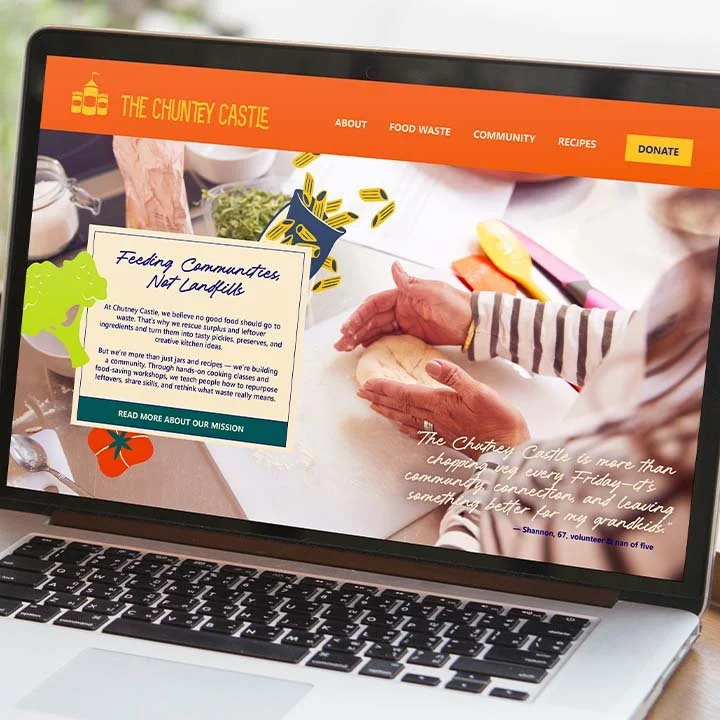
The Chutney Castle started with a simple idea: save food from going to waste and use it to bring people together. Their old branding made it hard for people to understand what they stood for. The colours were harsh, the logo felt outdated, and the purpose was getting lost. Some thought it was a kids’ brand, others thought it was a business. We wanted to help them show the world their true heart: feeding communities, not landfills.
We listened to their story and their struggles, and set out to design something that felt honest, warm, and easy to understand. We wanted everyone to know, at a glance, that The Chutney Castle is a charity built on kindness and community.

Colors from the garden, labels from grandma’s kitchen.
Our approach centred on empathetic, purpose-driven branding, rooted in the belief that charity visual identity should inspire connection and action. We drew inspiration from vintage recipe cards and jam labels, evoking nostalgia while ensuring modern clarity and accessibility.
The refreshed colour palette features leafy greens, veggie-inspired hues, and a deep heritage blue, balanced by a warm cream reminiscent of vintage paper. This signals sustainability and enhances readability and inclusivity across digital and print channels.
The new logo forms a playful tower of jars and bottles, symbolising community, collaboration, and the joy of food preservation. Custom illustrations and a vintage-inspired typeface reinforce the handmade, approachable ethos, while the slogan, “Feeding communities, not landfills”, clearly communicates the charity’s broader social and environmental impact.


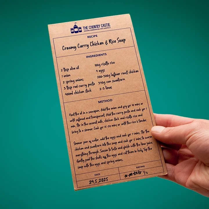


The power of “made by me” in packaging design.
A key innovation in our packaging design was the intentional use of psychological principles to drive positive behaviour change.
By making labels easy to personalise—whether typed or handwritten—we tap into the psychology of ownership and emotional connection.
When volunteers and workshop participants add their names or messages to each jar, it’s no longer just food: it becomes a personal creation, valued and cared for.
This sense of personal responsibility and pride is proven to encourage more mindful behaviour and reduce food waste, as people are less likely to discard something they feel connected to.
Our approach draws on consumer psychology to foster emotional bonds, activate personal norms, and inspire lasting, purpose-driven engagement with the brand.

Charity branding that builds belonging.
Charity branding shouldn’t feel distant or corporate. It should feel like an invitation. The Chutney Castle’s new visual identity is clear, kind, and built for everyone—young and old, food lovers and community builders alike. We believe branding for non-profits works best when it’s rooted in empathy and real stories, not just logos and taglines.
Now, The Chutney Castle’s brand truly reflects the heart behind every jar, making it easier for them to welcome more people in and inspire positive change, one batch at a time.
Let’s create a brand that brings people together.
Book your free discovery call and see how empathy-driven branding can help your brand shine.