

BEYOND THE POSTCARD:
DESIGNING A CITY YOU CAN FEEL
BRAND IDENTITY • BRAND STRATEGY• BRAND POSITIONING
Termoli, a sunlit coastal city on Italy’s Adriatic shore, is where medieval heritage, vibrant community, and maritime tradition blend seamlessly. This rebranding project, created for the TerraViva Design Competition 2025, captures Termoli’s unique spirit by balancing history and modernity, tradition, local pride and openness. The resulting identity system is both structured and playful, designed not around fleeting trends, but to stand the test of time. It gives Termoli a confident, contemporary voice while honouring its authentic character.
FOR

TerraViva Rebranding Termoli Competition 2025
BY
Salla Västilä
Brand Design, Brand Strategy, Brand Identity

Rooted in Termoli's maritime heritage,
this brand identity makes locals proud while inspiring travellers to discover Italy's hidden Adriatic gem.
A city that lives and breathes sea.
Perched along the Adriatic coast, Termoli is more than a picturesque town—it’s a beautiful combination of history, community, nature and coastal rhythm. Stunningly sunny beaches meet ancient stone walls, and every corner of the medieval Borgo Antico tells a story shaped by sea winds, fishing nets, and stories passed down through generations.
But what makes Termoli truly unforgettable isn’t just its beauty. It’s the feeling you get walking its cobbled streets or watching the sun dip behind the Swabian Castle—the quiet authenticity, the warmth of a neighbour’s smile, the sense that you belong.
“My biggest dream is to move to Termoli for its peace and authenticity.” — TermoliOnline, 2019
“Hospitality is a gift from the people of Termoli… you can feel welcomed and part of the family.”
— Idealista, 2023
What we set out to create wasn’t just a visual identity. We wanted to create something that feels like Termoli itself—warm, open, quietly proud. A brand that reflects the city's soul and invites both locals and visitors to see Termoli not just as a destination, but as a place to belong, to return to, and to believe in.

Termoli’s many stories.
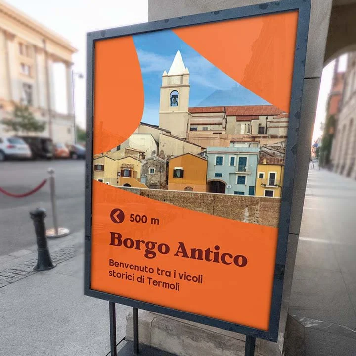
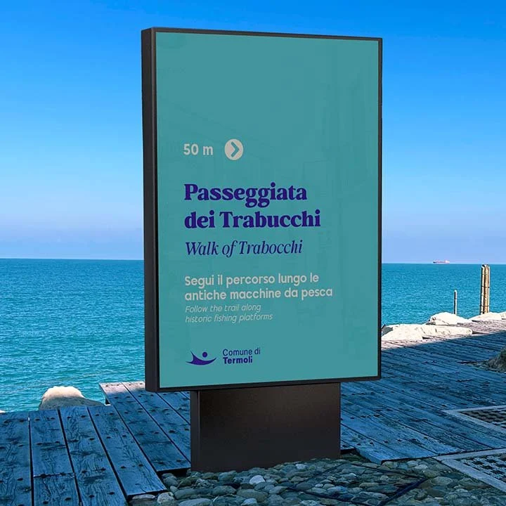
This identity was designed to feel like Termoli, not just to look good on a postcard. Our process was rooted in empathy and cultural insight, beginning not with design trends but with the city’s rhythms, textures, and community spirit. The trabucchi—traditional fishing huts Termoli is known for—became a central metaphor, inspiring a logo that is open to interpretation and rich with meaning. Whether seen as a net, a wave, a pearl, or a welcoming figure, it reflects a community shaped by the sea, by time, and by human connection.
The visual system draws directly from Termoli’s environment, with colours and forms that feel familiar, human, and grounded. Rounded icons, flexible patterns, and accessible typography ensure clarity and legibility for all ages—a crucial principle in public-facing city branding.
This is a brand built for longevity. Every element was crafted to serve the city for years to come—timeless, distinctive, and unmistakably Termoli. The result is a flexible, emotionally grounded identity that reflects the uniqueness of Termoli, not a copy of other cities, but something unmistakably its own.


Design that belongs everywhere.
Termoli’s design system is to be adaptive and immersive, appearing not just on brochures, but across city signage, public transport, wayfinding, event materials, merchandise, guides, and digital platforms. Patterns and iconography can morph into playful illustrations, dynamic backgrounds, or frames for photography, always maintaining a cohesive and recognisable look.
A highlight of this system is its flexibility: the identity can expand to celebrate special moments, like Termoli’s candidacy for Italian Capital of Contemporary Art 2027. For this, we created a dedicated logo variation and interactive visual elements invite public participation, turning the brand into a platform for community expression and creativity.

Cities that live in hearts, not just
Place branding is more than an emblem or colour palette, it’s about capturing a city’s essence and forging emotional connections that last decades. For Termoli, this means telling a story that feels authentic to its residents and magnetic to visitors. The identity strengthens community bonds, celebrates local culture, and positions Termoli as a vibrant, forward-thinking destination on the Adriatic.
A successful place brand is inherently dynamic, adapting to the city’s evolving needs and contexts. It helps cities attract tourism, investment, and new residents while fostering a sense of pride and belonging among those who already call it home. When done with empathy and clarity, place branding transforms a location from a dot on the map into a living, lasting experience.
Let’s make your place the story people feel part of.
Book a discovery call and see how empathetic branding can create places people love.