
Building Brand Loyalty Through Color Consistency and Brand Psychology
Quick Summary:
Consistent brand colors build recognition and trust, strengthening long-term brand loyalty.
Brand psychology shows customers form emotional attachments to color, making consistency critical over time.
Color consistency can increase brand recognition by up to 80%, reinforcing emotional memory.
Unplanned color changes risk emotional disconnection, leading to lost trust and repeat purchases.
Effective brand color psychology depends on implementation, not just choosing the right colors.
Color emotion plays a measurable role in loyalty, influencing recall, conversion, and customer lifetime value.
Empathy-driven color strategy treats color as communication, not manipulation.
You might have heard multiple times how choosing the right colors for your brand matters. But what matters more is the consistency in how those colors are applied is what builds lasting brand loyalty. Adobe’s research shows that one in three consumers are more likely to stay loyal to brands that do not change their color schemes. At the same time, 12% have stopped shopping with brands after a color change.
This insight alone demonstrates clearly how customers form emotional attachments to brand colors. When those colors change without clear purpose, the psychological contract between brand and customer is disrupted. From a brand psychology perspective, consistent brand colors reinforce emotional memory. They also strengthen trust and long-term customer attachment.
Understanding how to implement and maintain color consistency is essential for building unshakeable brand loyalty and increasing customer lifetime value.
At Ainoa, we see many brands understand brand color psychology in theory but struggle with implementation in practice. This article provides a practical framework for applying color strategy consistently across touchpoints. It also highlights common mistakes and explains how to measure whether your color decisions are delivering real business results.

Color consistency only works when colors are designed for the environment and audience they appear in — what feels fresh and expressive for Gen Z may feel overwhelming or out of place elsewhere.
Why Color Consistency Drives Recognition and Trust
The power of color consistency lies in neuroscience and brand psychology. When customers encounter the same brand colors repeatedly, their brains form stronger associations with that brand. This process is known as neural consolidation or memory consolidation. It increases memorability and helps brands stand out in crowded markets.
Consistent use of brand colors can increase brand recognition by up to 80%. This effect is driven largely by repetition and familiarity. Iconic brands like Coca-Cola, Tiffany & Co., and McDonald’s are instantly recognizable because their color palettes have remained stable for decades.
Consistency also signals reliability; When colors are applied intentionally and consistently, brands feel organized and professional. Inconsistent color use creates confusion and weakens trust. This is why one in three consumers report stronger loyalty toward brands that maintain consistent brand colors.
The Emotional Impact of Color Changes
Color consistency is both cognitive and emotional. In brand color psychology, color acts as an emotional anchor. It is tied to familiarity, safety, and trust. When customers build emotional bonds with a brand, those bonds extend to visual identity elements, including color.
Adobe’s study linked above shows that 18% of consumers feel emotionally disconnected when a brand changes its color scheme. This emotional disruption explains why 12% stop shopping with brands after color changes. Customers are not reacting to aesthetics alone. They are reacting to the loss of emotional continuity.
From an empathy-driven marketing perspective, this matters. Color changes should only happen when driven by genuine brand evolution. When changes do occur, they must be communicated clearly and implemented carefully to preserve trust.

Luxury color palettes often rely on muted tones and subtle accents. Here demonstrated how restraint, saturation, and material cues shape emotional perception more than color alone.
Common Mistakes in Brand Color Strategy and Implementation
Understanding what not to do is as important as knowing what to do, especially when applying brand psychology to color strategy.
Mistake 1: Choosing colors based on personal preference. Personal taste does not determine brand effectiveness. Color decisions must be based on research into target audience emotion, brand positioning, and competitive context.
Mistake 2: Ignoring saturation and color combinations. Individual colors carry meaning, but saturation and combinations change perception. Muted tones often signal heritage and luxury. Highly saturated colors communicate energy and urgency.
Mistake 3: Assuming color associations are universal. Cultural context shapes meaning. White signals purity in many Western markets, but mourning in some Asian cultures. Global brands must research color meaning locally.
Mistake 4: Changing colors without strategic justification. Unnecessary color changes disrupt emotional attachment and weaken brand loyalty. Many heritage brands retain their palettes for decades because consistency builds equity.
Mistake 5: Treating color psychology as manipulation. Using color to falsely imply values, such as sustainability, erodes trust. Authentic color strategy communicates truth rather than disguising it.
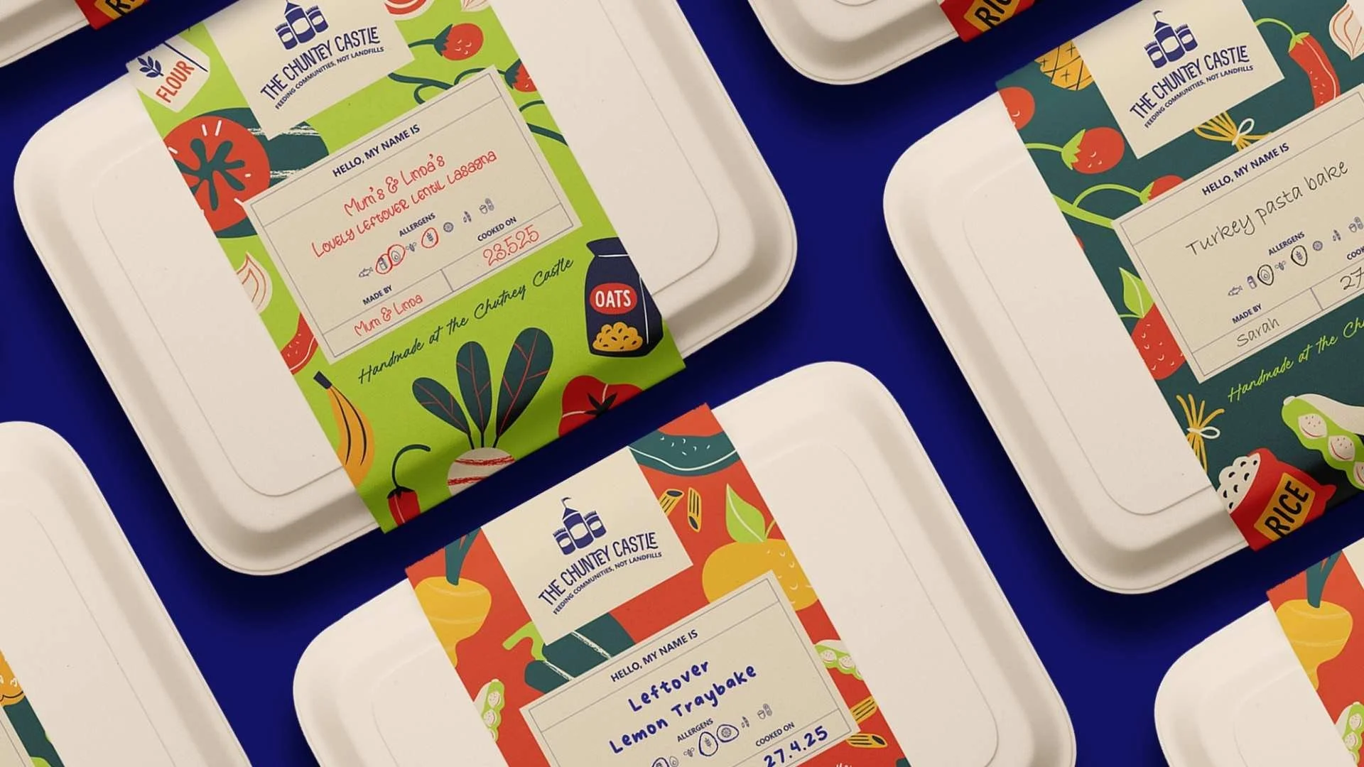
The Chutney Castle’s packaging shows how strategic color choices can balance appetite appeal, sustainability cues, and emotional ownership — reducing waste by making products feel personal and valued.
A Practical Framework for Color Strategy Implementation
Developing an effective brand colour strategy requires systematic thinking: structure and clarity. Here's a framework for success:
Step 1: Define Your Brand Personality and Positioning. Before selecting colors, clearly define your brand’s values and personality. Use brand psychology to guide these decisions. Your colors should reinforce who you are, not contradict it.
Step 2: Research Your Target Audience. Understand emotional needs, values, and preferences through research. Different segments often respond differently to color emotion.
Step 3: Analyze Competitive Color Landscapes. Study how competitors use color. Look for opportunities to differentiate while staying appropriate to your category.
Step 4: Select Your Primary Color Palette. Choose brand colors that align with personality, resonate emotionally, and stand apart visually. Test them in real contexts before committing.
Step 5: Define Supporting Colours and Saturation Levels. Document complementary colors and saturation rules. Specify hex codes for digital use and Pantone codes for print to maintain consistency.
Step 6: Establish Consistent Implementation Standards. Create clear brand guidelines for all touchpoints. This includes websites, packaging, advertising, social media, and physical environments.
Step 7: Measure and Refine. Track performance metrics to understand whether your color strategy generates intended emotional responses and business results. Always refine based on data rather than intuition.
Measuring Color Strategy Impact
Measuring outcomes helps connect color emotion to real business performance. These key metrics include:
Brand Recognition and Recall: Measure how effectively your target audience recognises your brand by color alone, without seeing logos or names.
Emotional Engagement: Measure emotional responses to your colors through surveys asking customers how your colours make them feel.
Purchase Intent and Conversion: Monitor whether color consistency or changes correlate with conversion rate changes, average order value, or purchase frequency shifts.
Brand Loyalty Metrics: Track repeat purchase rates, customer lifetime value, and Net Promoter Score. Strong color strategy should correlate with increased loyalty over time.
Social Media Engagement: Monitor whether content featuring your brand colors generates higher engagement rates than content using other colour palettes.

The same colors can feel joyful or alienating depending on who they’re for. Effective color strategy requires deep understanding of age, culture, and everyday context.
The Future of Brand Colors in Brand Strategy
AI-driven tools are making it easier to personalize and test color strategies. Some brands are experimenting with adaptive palettes that shift based on context or user behavior. However, authenticity remains essential, especially during the era of AI. Personalization should feel supportive, not manipulative.
Adobe’s recent study from 2025 suggests future branding will balance AI-driven tones with organic, grounded palettes. Also Pantone’s color of the year is also recommended to be paired with muted colors as well as tropical neons. This reflects a growing desire for both innovation and human connection.
Conclusion: Consistency as the Path to Unshakeable Loyalty
Color consistency is the foundation of lasting brand loyalty. Choosing the right colors matters, but maintaining them over time is what builds recognition, trust, and emotional connection.
When applied consistently, brand color psychology becomes a long-term driver of brand perception and loyalty. Brand colors are not decorative choices, but essential emotional signals for your brand.
By using color strategically, implementing it consistently, and grounding decisions in empathy, brands create identities customers recognize, trust, and return to.
If you are ready to build a color strategy that strengthens loyalty while authentically representing your values, Ainoa can help. We combine psychological research with Nordic design thinking to create visual identities that connect emotionally and deliver measurable results.