
The Science Behind Brand Color Psychology: Why Color Matters More Than Words
Quick Summary:
Brand psychology shows that color influences perception faster than words, shaping emotional responses within milliseconds.
Color emotion is rooted in neuroscience but shaped by cultural context, meaning color associations are never universal.
Brand colors play a major role in decision-making, with research showing color drives up to 90% of first impressions.
The effects of color depend on context, including brand positioning, product category, and target audience expectations.
Color appropriateness strengthens brand perception, while mismatched colors reduce trust and emotional connection.
Cultural mood and timing influence how colors are interpreted, as seen in public reactions to major color trend announcements.
Strategic color choices help build a strong brand identity, increasing recognition, loyalty, and long-term customer experience.
Using a color emotion guide within a broader brand strategy allows brands to create identities that resonate emotionally and culturally.
The colors you choose for your brand influence customer decisions faster, and often more powerfully, than any words you write. Research shows emotional responses to color occur in as little as 100 milliseconds. That means your audience forms emotional associations with your brand before conscious thought begins.
Brand color psychology is grounded in neuroscience, but its effects are also shaped by cultural context and lived experiences. Together, these factors determine how color creates emotional connections. For brands committed to building a strong brand identity that connects with customers, mastering color psychology is essential.
At Ainoa, we regularly see branding marketers and logo designers underestimate the effects of color on brand perception and brand loyalty. Yet the evidence is clear as day: 85% of consumers say the color as the primary reason for choosing one product over another. Within 90 seconds of encountering a brand, up to 90% of first impressions are driven by color alone.
This color psychology guide explores the science behind brand psychology and explains why color choices play a defining role in customer experience, emotional connection, and long-term brand strategy.
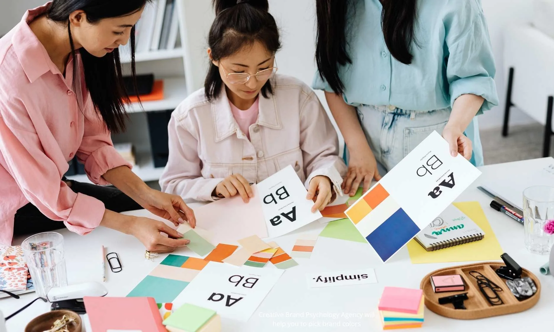
Choosing brand colors and typography with intention is a strategic decision.
What is Color Psychology in Branding?
Color psychology is the study of how different color influence human emotions, perceptions, and behaviours. In branding, it explains how brand colors shape identity, trust, and preference.
Color responses are formed through two mechanisms. First, your brain reacts neurologically; different wavelengths of light activate different neural pathways. Second, learned associations shaped by culture, memory, and experience shape your response to the color.
The brain does not process the colors you see solely as neutral visual data. Emotional and decision-making regions activate at the same time. Positive brand associations can even trigger dopamine release, reinforcing preference and recall. This means color is literally rewiring your customers' brains in favour of your brand at the neurological level.
Because most purchasing decisions happen subconsciously, color operates below awareness. 90% of purchasing decisions are driven by these subconscious factors, which means most decisions happen before rational thinking.
This means that the consumers rarely think, “I trust this brand because of its blue logo.” Instead, they might feel trust, calm, or confidence, and attribute those emotions to the brand itself.
Why Color Influences Behavior So Powerfully
The neuroscientific explanation for color's power is rather interesting. In short, color affects behavior because it interacts directly with the nervous system.
A longer, more scientific explanation is that when light enters your eye, it travels to the retina, where it's converted into electrical signals. Those signals then activate different neural pathways depending on the wavelength. Different colors activate different regions of your brain and trigger different neurotransmitter releases.
Red light, for example, increases physiological arousal. It can raise heart rate and intensify reactions, which is why the color red is common in food branding and promotions. This is why fast-food brands like Coca-Cola and McDonald's use red so prominently, as red literally stimulates appetite and creates a sense of urgency.
Blue activates your parasympathetic nervous system, encouraging calm and trust. This makes it a frequent choice for healthcare, finance, and technology brands. Blue is known to generally to reduce anxiety and signal reliability.
Some responses to color appear early in life, suggesting biological roots. However, cultural learning always overlays these responses. This is why color emotion can shift depending on geography, industry, or moment in time.
Understanding the psychology behind these effects allows brands to design visual identities that resonate rather than rely on aesthetic instinct alone.
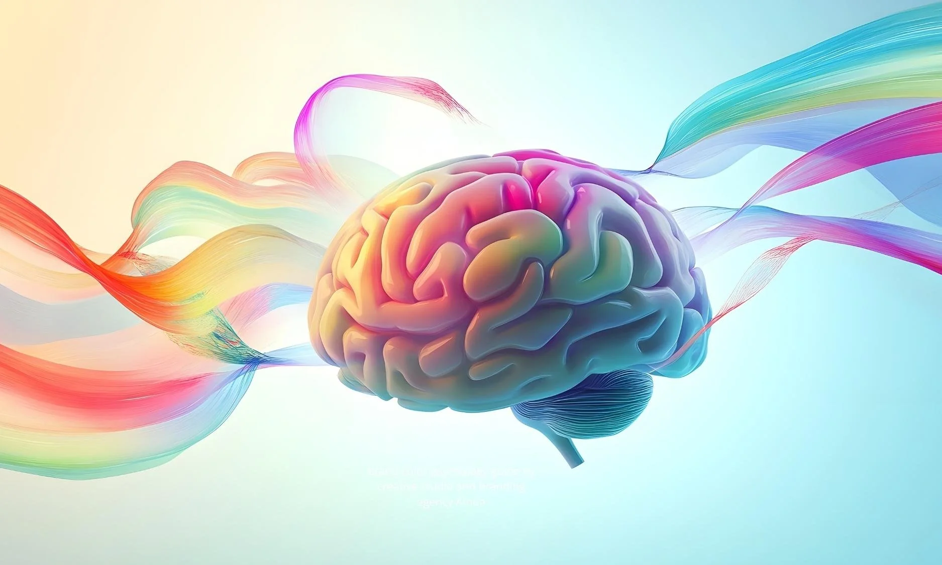
Color activates emotional and decision-making pathways in the brain before conscious thought begins.
The Data Behind Color, Brand Perception, and Loyalty
The impact of color on brand psychology is both well-known and measurable. According to Straits Research’s 2024 study, up to 93% of consumers base initial judgments on visual appearance. Correct use of brand colors can increase brand recognition by as much as 80%.
As can be seen from the stats, these aren't marginal effects, but clearly dominant factors in customer decision-making.
Iconic brands demonstrate this clearly; Think of Tiffany blue, Coca-Cola red, or McDonald’s yellow arches. These colors function as shorthand for the brand personality itself and customers recognise them instantly without seeing logos or names.
At the point of purchase, color continues to matter. Adobe’s study from 2025 found that one in two consumers has chosen one brand over another based on color alone, with Gen Z and millennials leading this behavior.
This means color doesn't just influence awareness or perception, but it directly affects conversion, recall, and long-term brand loyalty.
Emotional Connection: Where Color Becomes Brand Loyalty
Emotional connection is one of the strongest predictors of brand loyalty. Color is one of the most effective tools for creating that connection.
Customers who feel emotionally connected to a brand have 306% higher lifetime value and are 71% more likely to recommend the company. Additionally, emotional campaigns also outperform rational messaging in ROI.
This is where empathy-driven brand strategy matters. When brands choose colors based on a real understanding of their target audience—rather than trends or assumptions—they create identities that resonate on a human level.
By recognising that your brand colors will trigger emotional reactions before rational thought, you can choose your brand colors that align with your brand values and create authentic emotional resonance.
When used responsibly, color psychology strengthens trust rather than manipulates behavior.
Context determines whether brand colors strengthen emotional connection or weaken brand perception.
Why Context Matters: One Size Does Not Fit All
It’s important to recognize that the color effects are always contextual. The same color can strengthen brand perception in one situation and weaken it in another. Color effects are influenced by contextual factors, including product category, brand positioning, consumer demographics, and cultural background.
Research shows that unconventional colors can increase purchase intent for disruptive brands by 18%. Yet those same colors reduce purchase intent for established market leaders by 24%. This demonstrates that color cannot be separated from brand positioning or brand personality.
Similarly, color appropriateness is a key moderating factor. When colors feel misaligned with a brand’s message, responses decline. This is why luxury brands avoid neon tones, healthcare brands avoid aggressive reds, and children’s brands often favor vibrant palettes.
Context determines appropriateness, and appropriateness determines effectiveness.
When Cultural Context Overrides Design Intent
A recent, highly visible example can be seen in the public reaction to Pantone’s Colour of the Year 2026 announcement. Pantone described the shade as calm, balanced, and reflective—a visual pause during global uncertainty.
However, public response was incredibly divided. While some audiences welcomed the color as grounding and restorative, others reacted with frustration or rejection. Amid political tension and media saturation, people projected broader meanings onto the color, shaped by news cycles and social climate rather than design intent.
Multiple online commenters described the color emotionally empty, culturally detached, or even symbolic of disconnection from art, responsibility, or expression. In response, multiple social media communities proposed their alternative “colors of the year,” reframing the conversation around hues they felt better represented collective emotion.
This moment demonstrates a critical truth in brand psychology: color meaning is never fixed. Perception is shaped by context, culture, and timing. Intention alone does not determine how a color will be received.
For brands, this reinforces the need to understand not just the psychology of color, but the environment in which that color will be seen.

The same color can feel calming or controversial depending on cultural context and timing.
Beyond Neuroscience: Color as a Strategic Tool
Understanding color psychology transforms color from a visual choice into a strategic one. It allows brands to build identities that resonate emotionally and culturally.
The Nordic design principles offer valuable guidance here. Scandinavian visual identity emphasizes clarity, balance, and human-centered design. These values reflect cultural concepts like comfort and moderation, and show how color choices can reinforce deeper brand meaning.
When brand colors are selected with intention, they support a cohesive visual identity and a customer experience that feels authentic and aligned.
Conclusion: Color as the Gateway to Emotional Branding
Brand colors are among the most powerful tools in branding and should be picked carefully. They influence perception, emotion, and behavior before words are read or logic engages.
Despite this, many brands still treat color as an aesthetic afterthought. Understanding brand psychology and applying a thoughtful color emotion guide changes that. Color becomes a way to build trust, strengthen identity, and create emotional connections that last.
Brands that invest in strategic color selection gain an advantage that compounds over time—through recognition, loyalty, and resonance.
Articles on our blog may contain content drafted with the assistance of AI tools, always reviewed and polished by Ainoa's team.